Understanding Regression Analysis
Regression analysis is a powerful statistical method used to examine the relationship between two or more variables. At its core, regression analysis helps in predicting the value of a dependent variable based on the value(s) of one or more independent variables. The most common form is linear regression.
Types of Regression
- Simple Linear Regression: Involves two variables, one independent and one dependent.
- Multiple Linear Regression: Involves more than two variables, with one dependent and multiple independent variables.
Prerequisites
Before starting, ensure you have:
- Microsoft Excel (any recent version)
- A dataset with at least two variables
- Basic understanding of statistical concepts
Preparing Your Data
Before performing regression analysis, ensure your data is clean and organized:
- Organize your data into columns
- Remove any outliers that might skew the results
- Ensure data consistency by checking for missing values or errors
- Label your columns clearly
- Identify your dependent (Y) and independent (X) variables
Enabling the Analysis ToolPak
If you don't see the Data Analysis option under the Data tab, you'll need to enable it:
- Go to File > Options > Add-ins
- In the Manage box, select Excel Add-ins and click Go
- Check the box for Analysis ToolPak and click OK
Performing the Regression Analysis
Step 1: Input Your Data
Enter your data into an Excel worksheet. For example:
Step 2: Run the Analysis
- Go to the Data tab and click on Data Analysis
- Select Regression from the list and click OK
- In the Regression dialog box:
- Select Input Y Range (dependent variable)
- Select Input X Range (independent variable)
- Choose an Output Range
- Check "Labels" if your data has headers
- Click OK to run the regression analysis
Interpreting the Results
Key Statistics to Review
R-Square
- Indicates how well the model fits the data
- Values range from 0 to 1
- Higher values indicate better fit
P-value
- Determines statistical significance
- Generally, p < 0.05 indicates significance
Coefficients
- Show the relationship between variables
- Include standard errors and t-stats
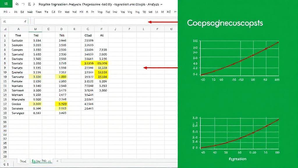
Visualizing the Results
To create a scatter plot with regression line:
- Select your data
- Go to the Insert tab
- Select Scatter from the Charts group
- Add a trendline:
- Right-click data points
- Select "Add Trendline"
- Choose options (linear, polynomial, etc.)
- Display equation and R² on chart
Best Practices
-
Always check assumptions:
- Linearity
- Independence
- Normality
- Equal variance
-
Document your analysis:
- Save all steps
- Note any data transformations
- Record assumptions made
Handling Common Issues
Missing Data
Outliers
Consider removing extreme outliers that might skew results, but document any removals.
For more detailed information, visit Microsoft's Excel Support Page, Statistics How To, or explore specialized software like R or Python.